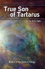
 True Son of Tartarus by M.R. Tighe is now available for purchase at Amazon. I designed the cover and interior pages a few months ago. It's the second book in a planned trilogy. Check it out!
4 Comments
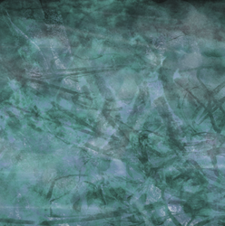
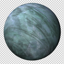
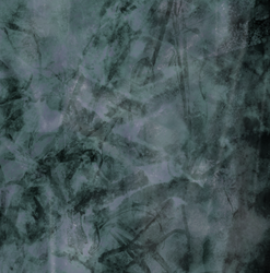
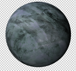
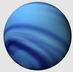
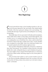
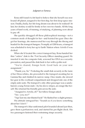
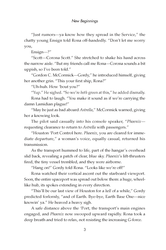
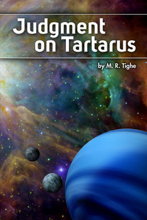 Cover design by PlanetGraham I recently designed a science fiction book titled Judgment on Tartarus (to be released on Jan. 15, 2011). I'm a big sci-fi fan, so I was glad to be able to work on this project. And since it has just been solicited at Amazon, I can share some details. For this particular book I designed the cover, as well as the interior pages. Cover Design The cover design request consisted of the following: Outerspace with a gray-blue or purple planet in the foreground, with a faint star in the background shedding a little light on the planet. The planet has two moons.  Hubble Photo I started with some photo research at NASA and found this colorful background photo at Hubblesite.org. FYI, photos that are available from NASA may be used freely as in the public domain, per their copyright notice. Next I needed a planet and two moons. Photoshop (Extended Version) has limited 3D capabilities so I used some stock texture images and "spherized" them. I enhanced the shadowing manually in Photoshop to produce the final planet and moons. Each sphere was created as a separate file and placed on top of the background image as a Smart Object so I could enlarge or reduce them without affecting their resolution. I actually created an "atmosphere" around the planet, but the author didn't want it, so I removed it for the final artwork. Here are the original texture images and how they look once they are wrapped around a sphere. 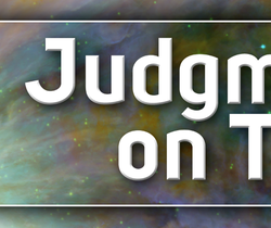 Finally, I chose a futuristic looking font called Uni-Sans Bold to create the title text. I put a small bevel on it and a drop shadow to make it pop. Interior Page Design For the interior pages, I had complete freedom to choose the fonts, design the individual pages and chapter openers, as well as the table of contents. For the body copy I chose Palatino – a reliable, legible serif font family. For the chapter titles, page numbers, running heads, and table of contents I used Futura – a sans-serif family that contrasted well with Palatino. Here are a few sample pages from the interior of Judgment on Tartarus. Some of the techniques used in the page creation include: Paragraph Styles, Character Styles, Nested Character Styles, Text Variables, Auto-Numbering, Master Pages, and Table of Contents Styles As I said before, I'm a big science fiction fan, so I am looking forward to getting a printed copy of the book to read. If you want to check it out, it's available for pre-order from Amazon for just $16.29.
|
Kerry GrahamExperienced Art Director / Creative Director / Project Manager. Designer of books, publications, textbooks, brochures, branding and identities, websites, and more. Archives
March 2013
Categories
All
Search PlanetGraham |




 RSS Feed